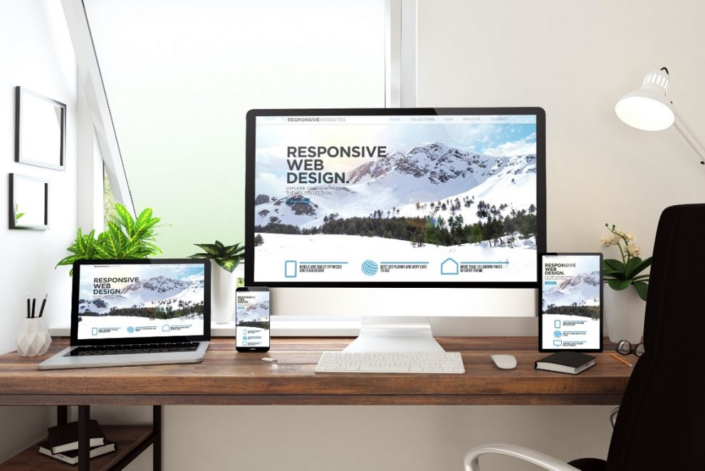
Responsive web design is what makes it easier for everyone to see the pages on a variety of devices and screen sizes. These days, every customer expects a responsive website so that they can easily navigate them from any device. To render this responsive web design services, web designers and developers use frameworks to help them craft good websites.
These frameworks help boost workflow while saving the valuable time of both the responsive web design company and the client as websites can be created faster. However, there is a wide array of frameworks available and new ones keep emerging. Among so, many choices, choosing the right and the best frameworks can be quite tough.
You might be drawn to a popular framework, but it might not fulfill all your needs. Do not worry, here in this post we will introduce you with the most popular options based on your needs. Better informed you will be able to choose the right one and complete your work quickly.
Bootstrap
This one is the most widely used CSS framework as it is free and open source. Created in 2011 by Mark Otto and Jacob Thornton, Bootstrap is now used to create millions of websites. This front-end framework is user-friendly and includes HTML, CSS, and JavaScript. One can easily develop responsive websites of all sizes and complexities. As Bootstrap is regularly updated, it includes the best and latest features helping create better websites.
Pros
- Responsive web design support.
- Extensive documentation.
Cons
- An immoderate number of DOM elements.
- An excessive number of rarely used styles.
Bulma
This is an open-source CSS framework based on Flexbox. It is extremely popular and used by over 150000 developers around the world creating websites loved by the customers. This framework is lightweight and responsive as it is based on a 12-column grid system. If you are a newbie, then Bulma helps you learn easier and faster.
In case problems arise, they offer a community to discuss and get answers to your problems. With Bulma, you can quickly optimize your website and it is updated frequently offering the latest features.
Pros
- Integrates with any JS environment.
- Enables you to quickly customize websites.
Cons
- CSS only framework does not include jQuery or JS plugins.
Foundation
This framework is highly advanced and was created by a web design company named Zurb. Foundation is an enterprise-grade front-end framework ideal for developing responsive websites and nimble. Popular companies like eBay, Adobe, Cisco, Disney, and Facebook to name a few use this framework on their sites.
This framework comes with GPU acceleration offering lighting fast and smooth animations. It has Fastclick.js for fast rendering for mobile devices. This versatile framework runs on Sass preprocessor and includes data interchange attributes. This enables you to load heavier HTML sections for larger screens easily.
Pros
- Great flexibility.
- Uses REMS thus eliminating the need for explicit height, width, and other attributes for each device.
Cons
- Size is big out of the box.
- A bit complex to use by beginners.
Conclusion
These are just a few of the best frameworks you can choose to render great looking responsive websites. All these frameworks bring different benefits, therefore choose the one according to your skill level and requirements. Get in touch with Blue Light Labs to help you choose the best framework for your website design. They are also the best Atlanta web design company offering responsive web design services at affordable prices.


Add Comment