With the internet giving anyone anywhere in the world the chance to encounter your company, it’s more important than ever that you have an inspired logo. Your logo is how your company makes its first impression, with its style and font being the most telling factors.
Sure, logos also get a lot of color and some other images thrown in, but the logo that displays your name is the one that potential customers and users will use as the basis of their decision to interact with your offering or not. Your logo doesn’t have to be overly flashy or even animated, but the design is important as it enables you to convey the unique message that your business holds.
The state of play in logo design has changed significantly over the last decade, again, mostly due to the influence of the internet. What was once eye-catching and even symbolic is now seen as old and outdated. Boiled down, the message of your logo comes down to the use of one of four fonts: serif, slab serif, sans serif, and script. Each font means something different to the modern audience, with new and successful brands moving away from the preferred styles of old.
The serif has become a thing of the past
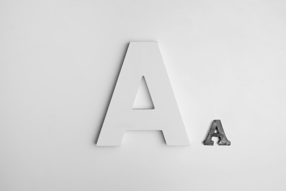
Use of the serif (the small fleck that tails off at the corners of letters), was the standard for companies in years past. Most companies opted for a light serif while others went all out with a much bolder slab serif. The popularity of the serif in its many forms established logos as being classy and established businesses. Although many companies that were established long ago or are trying to break into an industry of several storied competitors maintain the serif in their logos.
Source: Unsplash
In the realms of fashion, the serif upholds this image of class, with the likes of Gucci, Tiffany & Co., Rolex, Prada, and Burberry, all maintaining the serif in their primary company logos. However, as time has moved on, the serif has become the symbol of old business. While this impersonation still has its uses for a new company, most look to stand out as new, memorable, modern, and the next best thing.
Perhaps the company most synonymous with the modern age, Google, started life with a logo in a serif font but, five years ago, the search engine giant decided to make a change, with the switch away from a serif front reinforced the new standard of logo creation in the digital world. The Google logo totes a much more simplistic, modern, and playful look that appears to be more welcoming and less standardized.
The rise of sans serif and script
With the serif removed, the modern font of the logo was formed. Just as script gave way to the bolder, more simplistic serif form, serif has made way for sans serif, with modern companies the world over adopting it for their Latin alphabet branding. Not only does the use of sans serif show a modern company, but it also has more connotations to customer enjoyment, with sans serif being very common in entertainment branding.
Google’s switch from serif to sans serif further established this move, but it has been evident in the gaming industry for years. Microsoft, PlayStation (in its long-form), Nintendo, and Epic Games all utilize sans serif in their logos. Long-standing game companies like Electronic Arts and Sega have also amended their logos from a serif-based font to sans serif.
In the most modern and ever-evolving gaming space, that of iGaming (casino gaming online), new brands and platforms are popping up every day. With these new platforms, the sans serif font is the most popular, with the likes of Good Day Slots, Great Britain Casino, Chilli Casino, Online Casino London, and The Gold Lounge all presenting themselves with a logo in a sans serif font. This helps to illustrate these brands’ modern and sleek aesthetic, furthering the idea that these online casinos are competent in offering an exciting and varied catalog of titles.
Source: Unsplash
Due to the level of competition, though, brands need to try other methods for their logos to stand out, which is why some innovative designers seek to rejuvenate the font style made outdated by serif, script. By embracing the squiggles and free-flowing nature of the script font, new gaming platforms like Pokie Spins, Fruit Kings, Fluffy Spins, and Incredible Spins are able to relay a sense of fun and entertainment.
Many of the most recognizable brands in the world have utilized the script font in its most standardized form for decades, with Coca-Cola, Barbie, Ford, Kleenex, Disney, and Kellogg’s all upholding script. Modern designers who are adopting the script font take it further than just script letters, with the newfound playful nature of the font catering to letters taking new forms and smaller images being included as a part of the text.
The modern way to create a new logo is in a sans serif font, but some are also finding success with the more lavish and expressive script font. In any case, serifs are becoming increasingly out of fashion when it comes to new branding.


Add Comment