
If your website isn’t generating the number of conversions you would like, it may be because your prospective customers aren’t quite sure what they should be doing. Do you want them to contact you, make a purchase, or sign up to your mailing list? If you aren’t telling them clearly and concisely, they may not get the message.
Calls to action can help to eliminate this problem for your website. These are simple commands that tell your website visitors exactly what to do so there’s no confusion. If you’re looking to make the most of your online presence and secure more sales, some effective calls to action could be just what you need.
Here, we’re going to provide you with our top tips for creating website calls to action that will boost your conversions. Take these tips on board and it shouldn’t be long before you’re seeing the results you’ve always wanted.
Ensure your calls to action are hard to miss
The first step in creating effective calls to action involves ensuring your website visitors are definitely going to see them. And there are a number of techniques you can use to reduce the chances of them being missed.
Firstly, it’s a good idea to present your calls to action on buttons that customers can simply click on if they want to move further into your sales funnel. And, you should strive to make these buttons stand out by choosing a color that will contrast beautifully against your site’s background. If you have a simple white background, a bright color such as green, blue, or orange will do. But, if your web page has a more colorful background, it’s best to take a look at the color wheel to work out what is going to stand out best.
You should also choose the positioning of your calls to action carefully. Essentially, you want to put them in a spot where visitors are definitely going to see them. Adding a call to action to your navigation menu can be very helpful, as it will be one of the first things people see. But, generally, if you can include at least one call to action above the fold so people don’t have to scroll down to see it, you’ll be onto a winner.
To give you some inspiration, let’s take a look at a couple of examples of effective calls to action you can learn from.
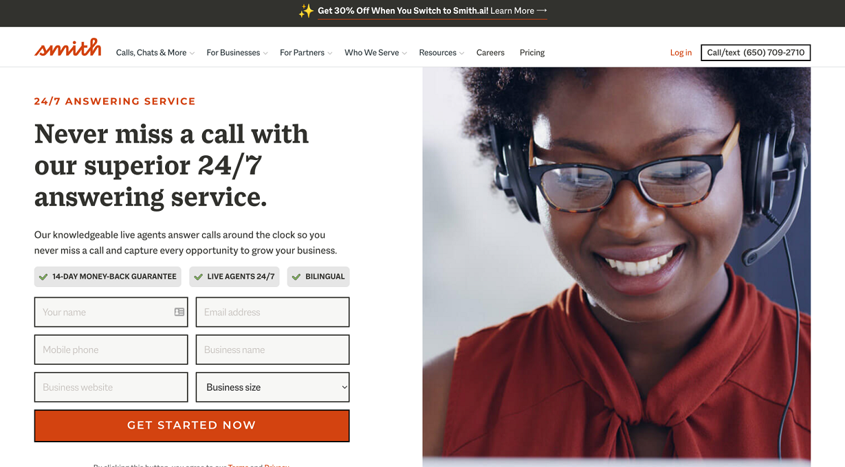
Smith.ai is a company that helps other businesses with their customer service. And, on their 24/7 phone answering service page, they have a very effective call to action that reads “get started now”.
This call to action is visible as soon as you land on this page — no scrolling needed. This means it’s very hard to miss the button. Plus, the command comes with a striking orange background, which is in keeping with the company’s branding. While it complements the design of the page, it still stands out as it’s placed straight after a block of text and a contact form that is entirely black, white, and grey.
This just goes to show that your call to action buttons don’t need to be garish — as long as they are easy to spot among the rest of your copy and page elements, they’ll attract attention. So, when designing your own service pages, consider taking a leaf out of Smith.ai’s book by designing complementary call to action buttons that stand out without looking out of place.
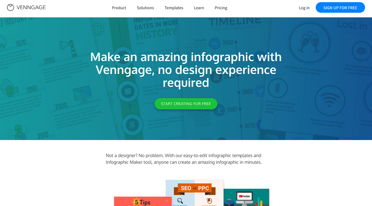
Venngage also has a fantastic example of a call to action on its infographic maker page. As you can see, they have a bright green button that reads “start creating for free” and this contrasts perfectly against the blue background they’ve used.
The company specializes in graphic design, so it makes sense for them to have a busier page design that helps to showcase what they do. But their call to action button still draws the eye because it’s so bright and bold.
You don’t need to be afraid of using plenty of color and impressive design elements on your web pages if you want to show off your personality and what you’re capable of. You just need to choose the color of your call to action buttons carefully so they stand out and attract plenty of attention. Using a subdued background shade and a brighter color for your button just like Venngage will do the trick.
Getting your website design right is incredibly important for your business, and keeping these tips in mind when adding your call to action buttons should make all the difference and boost your conversion rate.
Create different calls to action for different groups of customers
Different people who visit your website will be at different stages of their buying journey. Some may be primed and ready to convert, while others could be looking for more information about what you can do before committing. You can use the power of calls to action to move all of these people through your sales funnel by providing different options to suit their needs.
Consider what people might want to do at different stages. If someone has questions, you could tell them to call you. Or, if someone is still trying to decide what they want to buy, you could instruct them to read a buying guide you’ve published to help them. Calls to action can be used to reach people at every point in your sales funnel.
To show you what we mean, let’s take a look at some examples of businesses that have done a great job of providing different calls to action for different people.
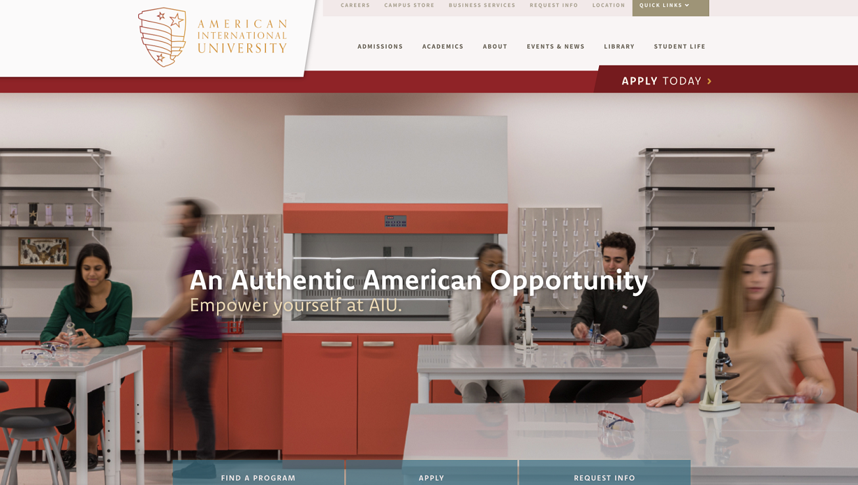
People will visit the American International University website at different stages in their journey towards committing to higher education. For instance, someone might simply be curious about the types of courses that the university offers, or they may have already made their mind up and could be ready to apply.
American International University is aware of this and has provided three different calls to action as a result: “find a program”, “apply”, and “request info”. This will help them to grab the attention of anyone who visits their website, regardless of how close they are to actually enrolling at the school. It’s also worth noting that all of these calls to action sit above the fold, so they’re very easy to find as soon as you land on the site.
Take inspiration from American International University and offer several different calls to action so you can grab as many people as possible. You can also offer up all of your options in the same place so nobody has to look particularly hard to find the button they require to move forward in their customer journey with you.
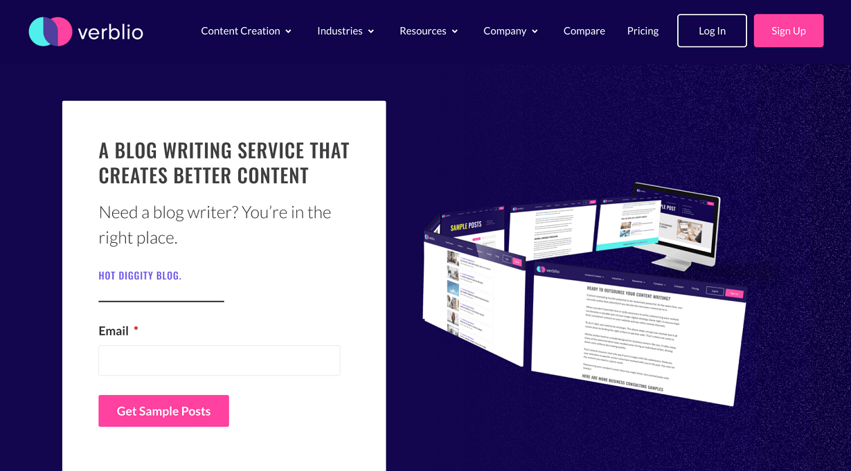
Verblio is a company that offers content creation services for other businesses. And, on their blog writing services page, they also provide multiple calls to action, although they take a slightly different approach with it.
This time, the calls to action are dotted around the page, so they aren’t all revealed at the same time. For instance, anyone ready to take the plunge can click on “sign up” in the top corner of the page, but everyone else will need to look further for their instructions. The second call to action someone will come across reads “get sample posts”, and this is designed for anyone who is interested in the company’s services but who wants to see what they’re capable of.
As you scroll further, there are multiple additional calls to action, such as “see how it works” and “read case studies”. Again, these are targeted at people who would like more information, and they provide people with options for accessing all of the details they need to move forward in their client journey.
This is an interesting approach, as the majority of Verblio’s calls to action encourage people to learn more about the company and their work, rather than leading prospective clients towards making a purchase. This focus on educating rather than selling could be very helpful for moving people through their sales funnel slowly but surely, so it’s worth considering whether using a tactic like this would also be worthwhile for your business.
Inject your calls to action with a sense of urgency
Ideally, you want to move customers through your sales funnel as quickly as possible, and you can ensure your calls to action help with this by injecting them with a sense of urgency. This can be as simple as adding time-sensitive words like “now” and “today”, or you could highlight if a particular product or service is only going to be available for a limited time only. For instance, you could mention “while stocks last” or encourage people to “get them before they’re gone”.
Essentially, you want to make people feel like they’re definitely going to miss out if they don’t invest in your products or services right now. It’s a great way to increase your conversion rate, and it should reduce the amount of time between someone finding your business and actually making a purchase with you.
Make it obvious if you’re offering something for free
Everyone loves a freebie so, if you’re offering something that doesn’t involve a financial commitment, you need to make this very obvious with your call to action.
There are a number of reasons why you might be offering something at no charge. For instance, you might be looking to build a mailing list by offering free templates as a lead magnet, or you could have a free trial people are able to use to get a real feel for your service. Whatever it is, you should leave no room for someone to wonder whether your freebie is actually going to cost them.
Offering a product or service for free can earn your customers’ trust and loyalty, so it’s well worth doing if you can make it work for your business. To give you some inspiration, here’s a business that uses a homepage call to action to highlight something they provide free of charge.
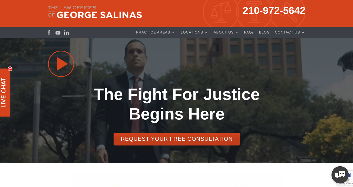
The Law Offices of George Salinas, a personal injury attorney in San Antonio, has a call to action on their homepage that encourages prospective clients to request a free consultation.
It’s very obvious from this call to action that anyone who clicks on it won’t incur a charge, and it’s also clear that they can simply book a consultation with no obligation to hire the firm afterward. People looking for legal help will really want to get a sense of how a firm can help them before making a financial commitment. They’ll want to feel confident that their case will be handled well and that they’re likely to get the outcome they’re looking for. Providing a free consultation will allow the company’s staff to put a prospective client at ease.
Depending on the type of business you run, it may be helpful to speak to your ideal clients ahead of them hiring you so you can ensure you’re going to be a good fit for each other. So, why not offer a free consultation for anyone who may need your help, and use a strong call to action to highlight this on your site? You’re likely to see some great results from using this strategy.
Use website visitors’ FOMO to your advantage
As humans, we can be very susceptible to FOMO, or the fear of missing out. So, it’s worth playing on this when creating your website’s calls to action if you want to get the best results possible.
The goal is to make your prospective customers feel like people just like them have greatly benefited from using your products or services. This way, they’ll be desperate to see what the hype is about and will be more inclined to invest in what you’re offering.
There are a number of ways you can use your calls to action to stir up a sense of FOMO in your audience. For instance, if you already have an impressive number of clients who you’ve helped, you could use a phrase like “join thousands of other business owners just like you”. It will make your target customers feel like they simply can’t afford to miss out on what you’re offering and it will push them to spend money with you as soon as possible.
If you can convince people that they’ll be much better off if they invest in your products or services, you’re likely to see your conversions increase dramatically.
Summary
Getting your website’s calls to action right can have a huge impact on your conversion rate and bottom line. So, take these tips on board and it won’t be long before you start to see the benefits. Everything from the design of your call to action buttons to whether you can stir up a feeling of FOMO in your audience can have a huge impact on your business’s success.
Want more tips on how to run your business well and ensure it prospers? Check out WebKu’s business archives for a lot more business advice.
Author bio & headshot:

Adam Steele is COO and co-founder of Loganix, which is an SEO fulfillment partner for digital marketing agencies and professionals. The company provides the SEO services that businesses need to grow and achieve their goals. If you enjoyed this article, you can find more SEO guides and templates on the Loganix blog.


Add Comment